Media of Trust: Visualizing the Pandemic
This article looks at the media of trust that immediately started to fill the blank spaces of pandemic uncertainty. They are in a position to create trust because they are bound to a visual and oral culture the society is acquainted with. This includes visualization devices such as dashboards that monitor the pandemic situation or podcasts that provide expert knowledge in a situation of extreme uncertainty. Media of trust are two-fold. The first dimension provides an overview of the pandemic and gives orientation in a situation of uncertainty. These visualization devices stem from a visual culture tied to managerial decision-making. The tensions that arise when such specific concepts are repurposed to visualize pandemic situations lead to the second dimension of media of trust. This includes oral media aimed at the individual, personal level that become important in situations of isolation during lockdown.
When the pandemic hit, what disappeared right away were planes and cars, people too. What appeared were blue skies, singing birds, COVID-19, and a nagging uncertainty. The latter emerged when existing modes of perception and orientation failed to account for the invisible dimension of aerosols and smear infection. As a result, spaces that have been taken for granted like supermarkets and cinemas became unsafe and potentially dangerous. They turned into “unmarked spaces” filled with non-knowledge. This article focuses on “media of trust,” on media that subsequently tried to reclaim these blank spaces of uncertainty that arose within society: devices and aesthetics that visualize the pandemic situation, dashboards, pandemic graphs and curves, graphical outbreak maps, images that offer a glimpse of what might lay ahead as well as voices and procedures that give confidence and comfort. Media of trust are technological, social, and aesthetic devices and procedures that give orientation and organize in a situation of extreme uncertainty because they are bound to a visual and oral culture that the society is acquainted with. They tap into established, well-known forms of media as points of departure to account for the unknown situation of a pandemic. Thereby, they provide for a mediated hypothesis between non-knowledge and knowledge that enables social action by reducing the “paralyzing fear” (Luhmann 1979, 4) of uncertainty.
Media of trust can be understood as two-fold in the way that the relations between non-knowledge and knowledge are expressed by and through different forms of media. The first dimension includes visualization devices such as the Johns Hopkins COVID-19 Dashboard. They provide an overview of the pandemic and stabilize systemic confidence and trust in political and social institutions and procedures (Lewis and Weigert 1985). As my argument has it, the epistemological stance of this visual culture of trust is not so much rooted in the history of pandemics but can be linked to a managerial culture of decision-making that appeared on the shores of economic management from 1900 onwards (Hoof 2020). Its specific rationality and epistemological structure then reappeared during the recent COVID-19 pandemic. Tensions and mistrust that arise when such specific concepts are repurposed to visualize pandemic situations lead to the second dimension of media of trust that are aimed at the individual, intimate level. This includes oral media such as podcasts, which provide working knowledge to cope with the situation, for example in the situation of isolation during a lockdown. Here, I use the German case of a successful COVID-19 science podcast to exemplify the relations and tensions between different forms of pandemic media of trust.
The Pandemic “At a Glance”: Aesthetics and Politics of Data Visualization
On January 22, 2020 the Center for Systems Science and Engineering at Johns Hopkins University launched the Coronavirus Resource Center and more specifically the COVID-19 Dashboard.[1] It was intended to “provide researchers, public health authorities, and the general public with a user-friendly tool to track the outbreak as it unfolds” (Dong, Du, and Gardner 2020, 533). Simple data visualizations, open source datasets, the concept of “live” data broadcasting, and the use of data prediction and extrapolation models made the system an immediate success. Within weeks it established itself as one of the most reliable monitoring systems of the pandemic.
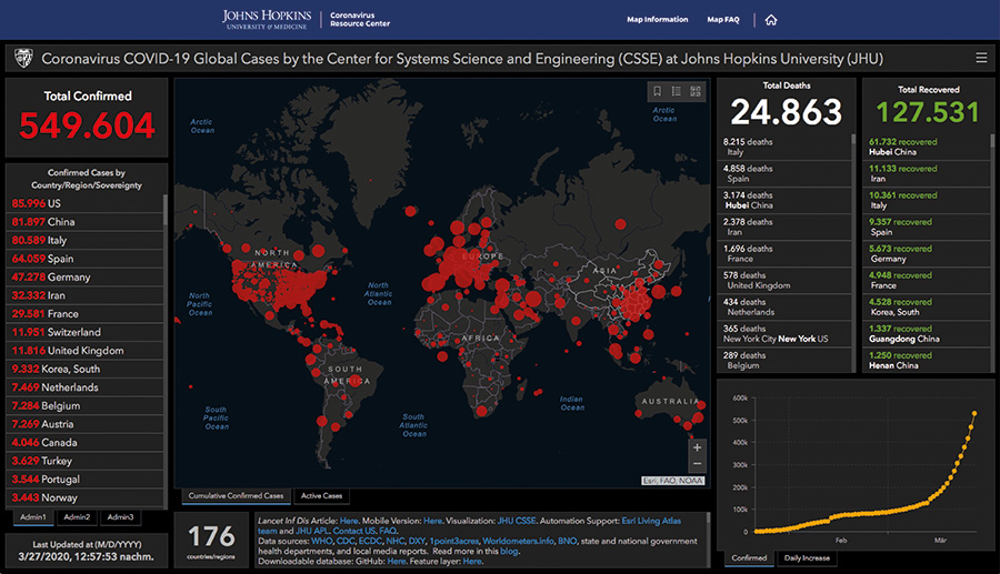
[Fig. 1] Johns Hopkins Dashboard, March 27 (Johns Hopkins, 2020)
What put the system ahead of official data provided by the various national centers for disease control was its big data approach to monitor the crisis. The system combined various data sources including official government reports but also online news services, or monitored twitter feeds.[2] These datasets were aggregated with “a semi-automated living data stream strategy” (Dong, Du, and Gardner 2020, 533) that combines automated data feeds with manual data practices such as the verification of numbers. The system harvests data from partly quite unreliable and random sources. This includes data that is altered or suppressed by political action but also data that is statistically distorted by the impact of different structures and (testing) practices within national health systems. When such data is gathered, processed, and visualized the poor quality of the raw data disappears from sight. Consequently, the dataflow of such a live casting device does not directly relate to single COVID-19 cases but is mediated through a layer of media technologies and practices that level and break down heterogeneous data sources into standardized items that can be cross referenced and mathematically combined (Hoof 2016, 43-47).
Built to “inform modelling efforts and control measures during the earliest stages of the outbreak” (Dong, Du, and Gardner 2020, 534) the dashboard can be described as a communication device that brings different institutions and individuals literally onto the same page. It is a machine that synchronizes expectations by turning a situation into a specific visual form. The dashboard creates its own history of the pandemic and gives orientation by placing the user on a time scale that incorporates the past and aims towards an unknown future of a perhaps flattened curve. The resulting curves and data visualizations are phantasms of modernity (Rieger 2009) that show the current pandemic situation “at a glance” (Hoof 2016). They provide for an abstract overall impression of how the dynamics of the pandemic unfold in different parts of the world.
Pandemic Aesthetics and the Visual Culture of Business Management
In the following section the text shows that these “at a glance” procedures and the visual aesthetics of the COVID-19 dashboard are part of a genealogy of managerial media. They are not specific to this pandemic, nor to medicine, epidemiology, or the history of pandemic outbreaks in general. Referred to as “graphical methods,” such visualization practices and aesthetics became popular at the beginning of the twentieth century and were widely adopted within business management as visual decision-making practices (Hoof 2020, 62-81). Like the COVID-19 dashboard they were aiming at turning heterogeneous events within corporations and economic markets into standardized data sets that could be accumulated, compared, calculated, and visualized. This mode of “visual management” (Hoof 2020, 14-6) created a wide range of data visualizations including break-even charts, danger-line charts, or hybrids between charts and tables.
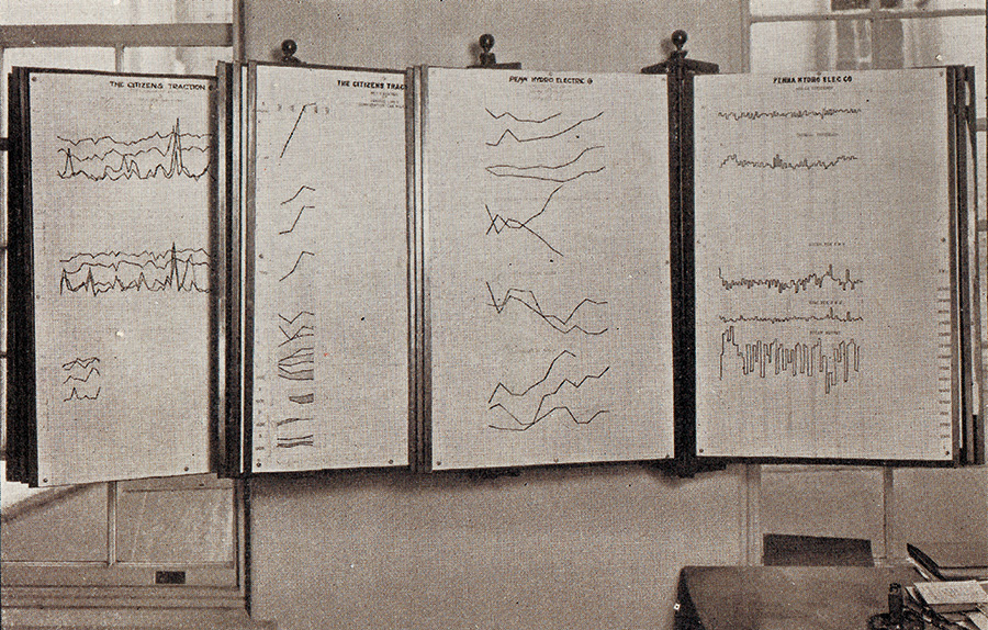
[Fig. 2] Early decision-making environments (Brinton 1919, 305)
These visualization devices were aggregated in decision environments, such as planning departments or charting rooms, to display data to executives and managers. A visual culture of decision-making emerged that separated everyday data from important trends that would help to anticipate the future. The latter data was broken down into abstract, standardized forms that could be recombined and reshuffled, allowing different scenarios for a given situation to be displayed (Hoof 2016, 34-5). The data that became part of such decision environments in the end were pre-selected and restricted to information that could be converted into a graphic form. This gave rise to an epistemology of media-based decision-making that was not so much based on concepts such as truth and falsehood but on visual abstraction and data selection. While the images of such data visualizations are easily accessible to non-experts, the models and procedures that generate the images in the first place remain partly obscured and can only be fully assessed by experts.
Modeling the Pandemic: Visual Suspicion and Mistrust
Current systems such as the COVID-19 Dashboard and its big data approach are still built on this epistemology of visual management. They depend on complex practices of visual abstraction and data selection that generate an overview of a given situation. Showing data “at a glance” enables orientation within an uncertain situation, thereby stabilizing trust in a system or a nation state. It suggests a model of political action that is oriented towards future developments of the pandemic and that rests on complex data interpolation procedures. The executive character of the COVID-19 Dashboard gives no explanation for the pandemic situation. The complex modes of data interpolation create visualizations that are aimed at fast decision-making, not at public debate. As a result, mistrust and tensions arise between such abstract forms of statistic data visualization and the subjective perception of pandemic events that unfold locally. What are the consequences when such dashboard aesthetics are approached by individuals that are not in a position to act in ways management or politicians are capable of; when they are confronted with an epistemology of decision-making that in a way permanently highlights their individual limited range of possible actions and that is based on data selection and modeling practices that are not well understood?
Interestingly, this did not so much lead to mistrust towards the big data approach of the dashboard but it started to create a climate of suspicion towards its data sources. An exemplary case that shows the effects of this asynchronicity is the changing public perception of the Robert Koch Institute (RKI), the German national center for disease control. In February and March 2020, at the beginning of the first wave of the pandemic the daily numbers of COVID-19 cases were made public by the director of the RKI at daily press conferences. These numbers relied on physical reporting from local authorities, which takes time. Consequently, when compared to the Johns Hopkins Dashboard the numbers were always already outdated. As a result, the bureaucracy, which was able, at least in the case of Germany, to efficiently contain the COVID-19 situation during the first wave of the pandemic, looks slow, clumsy, old-fashioned, not trustworthy. This impression of inefficiency is only one aspect of a general uneasiness that I would argue is related to the managerial dashboard aesthetics and its data interpolation practices. Because it suggests modes of behavior and action that are not available to the public, this constantly fueled a feeling of powerlessness and creates mistrust towards the media devices and data practices used to manage the pandemic. A tendency that can be observed in a wide range of countries and that amongst others lead to ‘alternative’ explanations such as conspiracy theories. But it also shows that the form of a medium plays an important role as to how a situation is defined, perceived, and understood.
An Oral Irritation: (Mis)Trusting Media Forms
To better understand how trust and mistrust relate to different forms of media, the case of Germany is particularly suitable. Here, quite unexpectedly, the pandemic, and as I would argue the tensions and uneasiness connected to visual media, led to the rise of oral media. Almost exactly one month after the COVID-19 Dashboard went online, the Corona Virus Update with Christian Drosten, a daily science podcast produced by the public radio broadcaster NDR, became the single most important source of first-hand information for politicians, journalists, and the public. Between the end of February and the beginning of May, a time that was characterized by lockdown measures and when the virus was still not well understood, this podcast series received 41 million downloads (Hennig 2020a). The series was basically an ongoing conversation between a science journalist and a virologist who specialized in coronavirus research (Hennig 2020b).[3] In the first weeks of the pandemic this was a daily format of about 30 minutes that explained the basics of virology and epidemiology. New scientific studies were discussed that would help to better understand how COVID-19 spreads, and these findings were then turned into immediate advice on how to minimize infection risks.
In a situation of a pending crisis, one might expect fast, real-time media such as the COVID-19 Dashboard to be popular. But instead a rather “old” medium that referred back to the oral tradition of the radio drew much attention (McLuhan 1964), a medium that not only does not match with the real-time concept, but a podcast that you even have to wait for and that takes time to listen to.
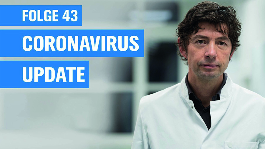
[Fig. 3] Corona Update with Christian Drosten (Screenshot: NDR info, 2020)
In contrast to the “at a glance” dashboard aesthetics the podcast consists of lengthy explanations, for example about how viruses reproduce. It compares the current situation with other pandemics such as MERS and SARS, or explains in detail differences between certain COVID-19 testing procedures concerning test reliability. The reasons why this podcast was so successful are not restricted to its form as a scientific conversation. It is moreover a result of the specificity of the podcast as an oral medium. Due to its portability as an audio file it is a medium of “intimacy” that “invades […] private spaces” (Berry 2006, 148). Furthermore, the “psychoacoustics” of compressed digital audio files lead to a certain form of perception that not only consists of conscious listening to arguments but also of a “direct and sensuous interaction with an embodied, sensing, unthinking subject” (Sterne 2006, 836). Consequently, the podcast not only explains complex scientific facts in a straightforward and understandable way, but also incorporates the intimate form of oral media. An aspect that gained additional significance in the situation of the partial lockdown, when people were kept in isolation and cut loose from their regular structures and rhythms of life. Here, the podcast offered a “regular and dependable event” that could be “integrated into the routines of daily life” (Horton and Wohl 1956, 216). By chance Christian Drosten also has a soft, radio compatible “beautiful voice” (Hagen 2005, 121-122), which was able to create “personal intimacy at a distance” (Horton and Wohl 1956). Over time this turned Drosten into a “persona,” a projection surface for para-social interactions of the listeners. He became the “nation’s voice” (Hilmes 1997, xvii) of scientific reason. His listeners even formed an “imagined community” (Hilmes 1997, 11) of people that shared the perspective of a scientific-based approach to handling the pandemic. Consequently, the podcast series enabled relationships of “bidirectional trust” between producers and consumers (Spinelli and Dann 2019, 92).
That a virologist became such a media personality shed light on the latent uneasiness that derives from dashboard media and its managerial “at a glance” aesthetics. As a consequence, a second trope of oral media appeared: media that would be trusted because they would give precise advice on how to avoid being infected. But that also would give comfort and reduce uncertainty by celebrating scientific methods and objectivity as a proper way to deal with the crisis; and by providing for an instance of para-social interaction as a way to address intimate feelings of uneasiness and loneliness. Here, this case blends seamlessly into the radio history of the twentieth century and its wide range of radio broadcasts, voices, and technology that became significant in situations of national crisis (Hilmes 1997; Hagen 2005; Birdsall 2012).
Pandemic Media of Trust: A Two-Fold System
So what are the consequences if we look at the relations between trust and the different forms of pandemic media? I argued that pandemic media of trust are two-fold. First, visual media produce systemic trust in political and social institutions and procedures. They provide an overview “at a glance” by combining a huge range of data. Here, visualizations of the pandemic define the situation and thus provide for orientation. And of course, these media have not been exclusively created for this specific pandemic. They were tailored for this event because they were at our fingertips, only waiting to be used. This led, as I have argued, to the adaptation of managerial media and logics for pandemic management. The genealogy of those visualization devices is not so much part of epidemiology or the history of pandemics, but is based on a visual media culture of managerial decision-making. Consequently, the current pandemic is mapped as an economic problem and interpreted by logics and devices that stem from the culture of visual management.
Tensions and mistrust that result from this “misuse” of economic devices and practices led, as I have argued, to the rise of a second dimension of pandemic media: oral media aimed at the individual, intimate level. They provide for working knowledge that offers a basic sense of trust about how to act within a pandemic. This trustworthiness is based on para-social interactions and the intimate character of oral media.
The tensions I described as a two-fold system of media of trust are symptoms both for the relevance and the limitations of the epistemology of visual management. It shows that the pandemic is predominantly understood through the lens of economic media. This in turn suggests that, as others have argued (Sarasin 2020), the pandemic, at least for the German situation, is not a biopolitical state of emergency. Rather, I suggest that it needs to be understood as a massive allocation of economic resources, a quite radical and uncertain experiment towards the future that is administered by media of visual management and that results in shifting bonds of trust.
References
Berry, Richard. 2006. “Will the iPod Kill the Radio Star? Profiling Podcasting as Radio.” Convergence: The International Journal of Research into New Media Technologies 12 (2): 143–162.
Birdsall, Carolyn. 2012. Nazi Soundscapes: Sound, Technology and Urban Space in Germany, 1933-1945. Amsterdam: Amsterdam University Press.
Brinton, Willard C. 1919. Graphical Methods for Presenting Facts. New York: The Engineering Magazine Co. First published 1914.
Dong, Ensheng, Hongru Du, and Lauren Gardner. 2020. “An interactive web-based dashboard to track COVID-19 in real time.” The Lancet Infectious Diseases 20(5) 533–534.
Hagen, Wolfgang. 2005. Das Radio. Zur Theorie und Geschichte des Hörfunks. USA/Deutschland. München: Fink.
Hennig, Korinna. 2020a. “Behind the Scenes II. Talk mit dem Podcast-Team.” Accessed July 3, 2020. https://www.ndr.de/nachrichten/info/Behind-the-Scenes-II-Talk-mit-dem-Podcast-Team,audio684596.html.
–––. 2020b. “Das Coronavirus Update mit Christian Drosten.” Accessed May 5, 2020. https://www.ndr.de/nachrichten/info/podcast4684.html.
Hilmes, Michele. 1997. Radio Voices: American Broadcasting, 1922–1952. Minneapolis: University of Minnesota Press.
Hoof, Florian. 2016. “Medien managerialer Entscheidung: Decision-Making ‘At a Glance.’” Soziale Systeme 20 (1): 23–51.
–––. 2020. Angels of Efficiency: A Media History of Consulting. New York: Oxford University Press.
Horton, Donald, and R. Richard Wohl. 1956. “Mass Communication and Para-Social Interaction: Observations on Intimacy at a Distance.” Psychiatry 19 (3): 215–229.
Johns Hopkins University Center for Systems Science and Engineering. 2020. “COVID-19 Dashboard.” Accessed May 2, 2020. https://coronavirus.jhu.edu/map.html.
Lewis, J. David, and Andrew Weigert. 1985. “Trust as a Social Reality.” Social Forces 63 (4): 967–985.
Luhmann, Niklas. 1979. Trust and Power. New York: Wiley.
McLuhan, Marshall. 1964. Understanding Media: The Extensions of Man. New York: McGraw-Hill.
Rieger, Stefan. 2009. Schall und Rauch. Eine Mediengeschichte der Kurve. Frankfurt: Suhrkamp.
Sarasin, Philipp. 2020. “Mit Foucault die Pandemie verstehen?“ Geschichte der Gegenwart 25. März, Accessed April 8, 2020 https://geschichtedergegenwart.ch/mit-foucault-die-pandemie-verstehen/.
Spinelli, Martin, and Lance Dann. 2019. Podcasting: The Audio Media Revolution. London: Bloomsbury.
Sterne, Jonathan. 2006. “The MP3 as Cultural Artifact.” New Media and Society 8 (5): 825–42.
Notes
[1] The system was built by Lauren Gardner, a civil and systems engineering professor at Johns Hopkins University and Ensheng Dong, a graduate student of hers.
[2] A full list of the data sources of the Johns Hopkins Dashboard is available here: https://github.com/CSSEGISandData/COVID-19/blob/master/README.md.
[3] Between February 26 and June 23, 2020, 50 episodes of the podcast were aired, in the first weeks of the pandemic on an almost daily basis. Later the frequency was reduced to two podcasts per week and later to a weekly podcast. Christian Drosten is a specialist on coronaviruses and head of the Institute of virology at Charité hospital in Berlin where he developed the first COVID-19 test. The podcast became so prominent that Drosten turned into a public figure. He received death threats and the largest German tabloid paper, Bild Zeitung started to campaign against him personally, including with a frontpage headline that falsely accused him of scientific inaccuracy in a study in preprint status. They were trying to link the study to the political decision to shut down schools and day care centers and to personally blame him for the decision.